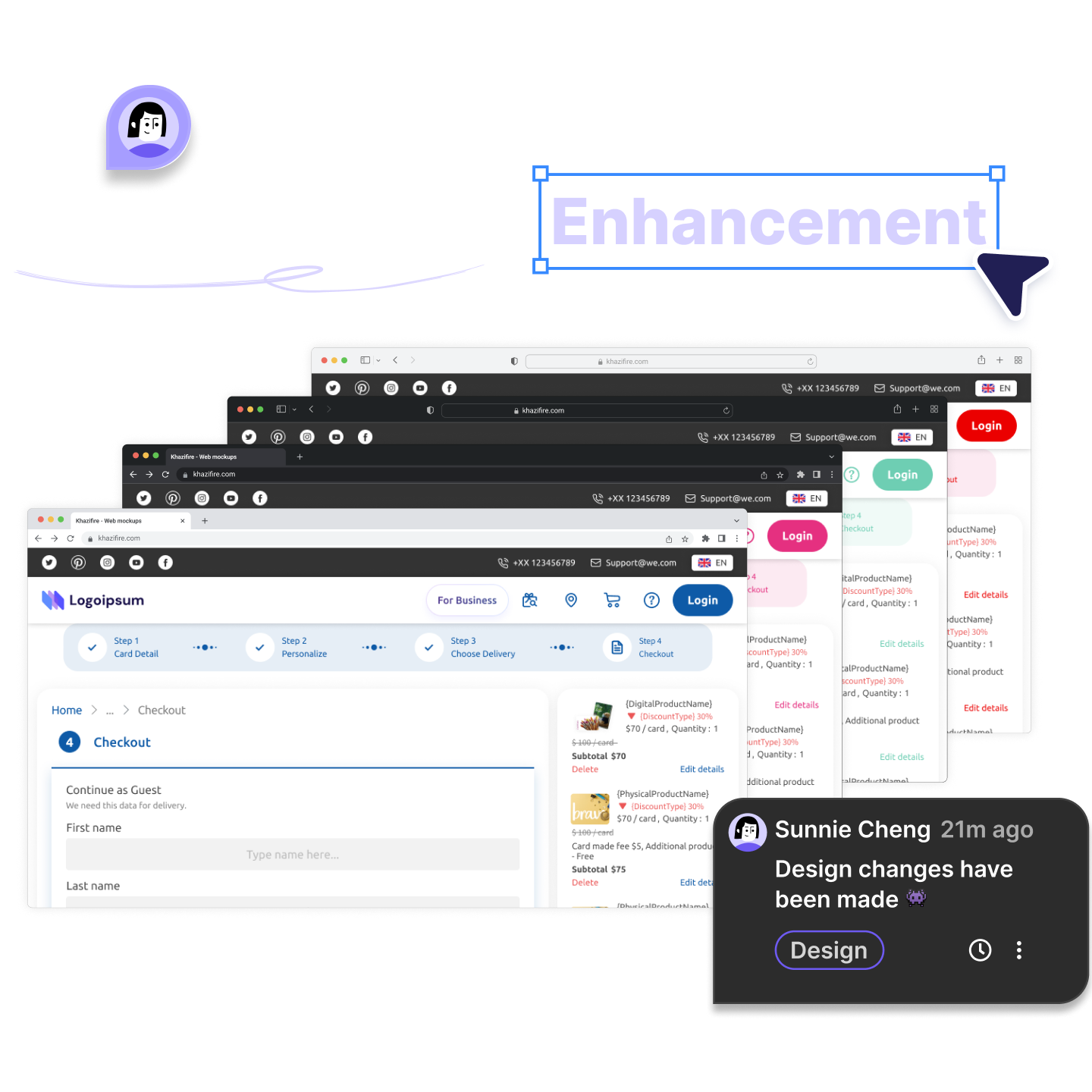
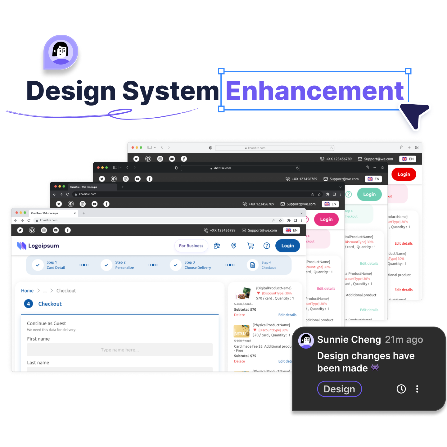
01 Overview
Before anything else: I didn't start this project
This project existed before I joined Ogloba.
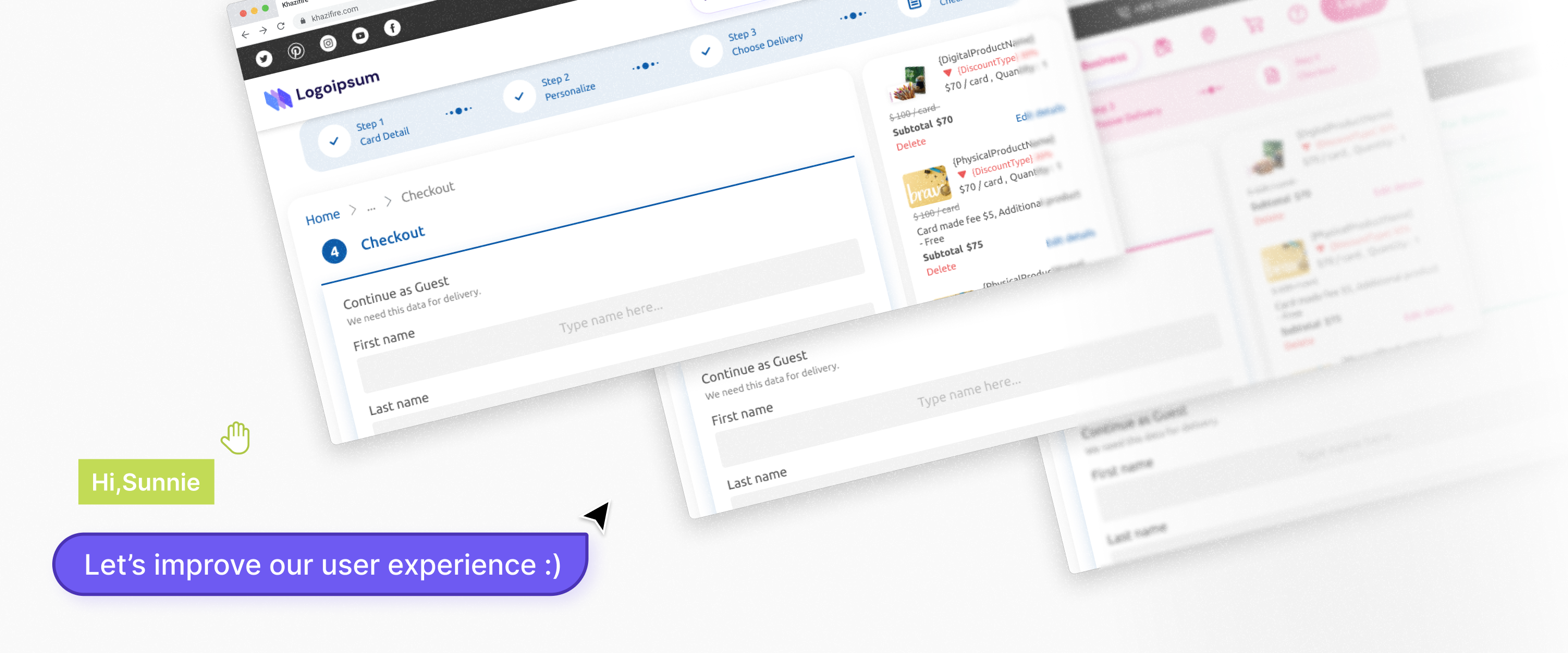
It's one of Ogloba's main white-label gift card platforms, a standard version running across 20+ retail clients (BUs) at once, each one using its own brand skin over the same system: different colors, languages, currencies, and footers, all held together by shared brand tokens.
My Job
My job here wasn't to build something new, it was to make the existing system better :
Taking real problems raised by clients and by our own business team, turning them into changes that held up not just on one screen, but across every brand the system served.
That constraint is the point of this whole project. In a white-label system, the hard part isn't designing a screen.
It's designing a component that still works when the brand color, the client's taste, and a technical limit are all pulling against the system's consistency.
02 Context
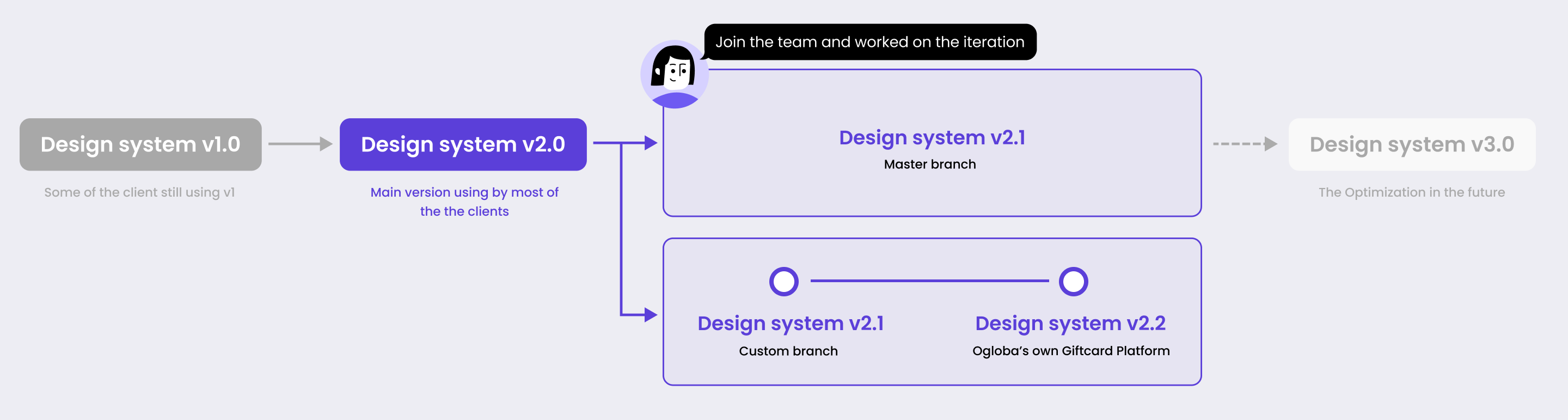
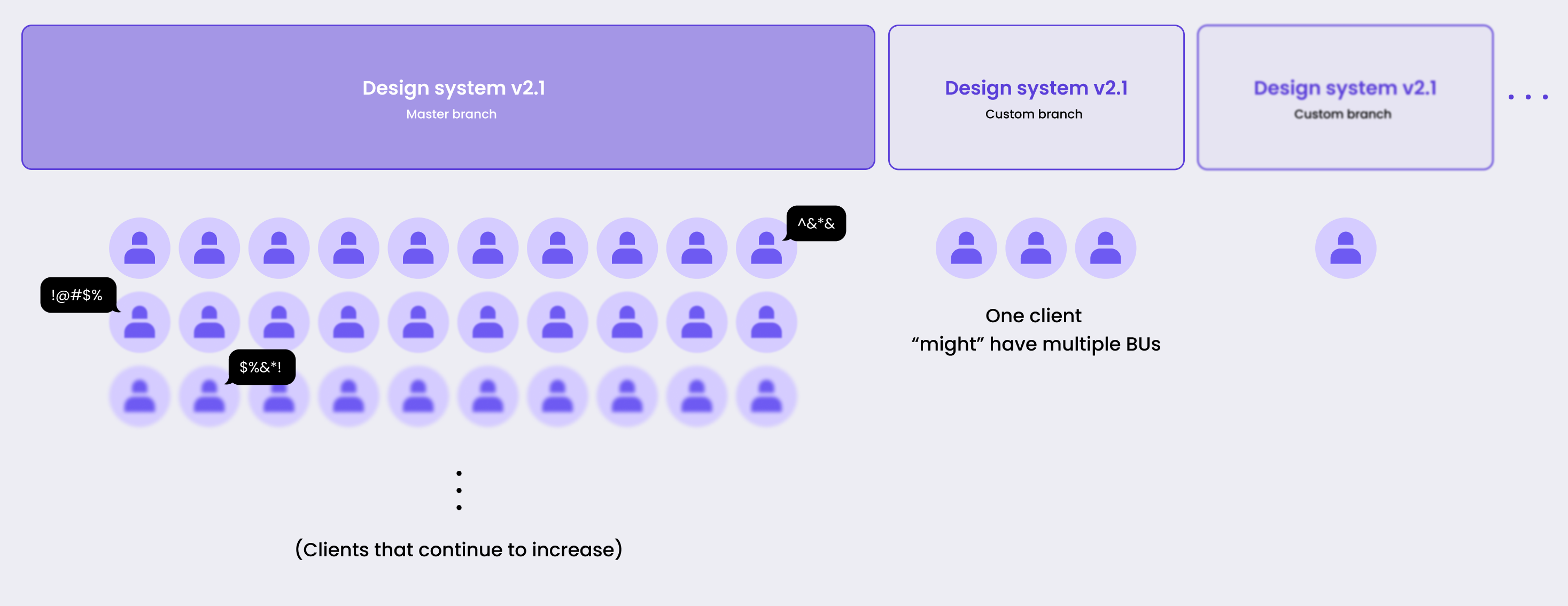
One change, and 20+ brands move with it
The whole system was maintained on a single standard version (master / main branch). A change made there didn't affect one product, it spread to every BU that followed the standard.
That works both ways, a good decision grows to 20+ markets on its own, and so does a bad one.
Something that solves one client's need perfectly can quietly create a new problem on another client's platform.
So for every change I proposed, the question wasn't "does this look right here."
It was "does this hold up under every brand the system carries."
Why this is harder than it looks ?
A component that reads perfectly on Ogloba's blue can quietly break on a red or pink brand.
The logic didn't change , the brand color just absorbed a state the user was supposed to notice.
This failure — working on skin A, quietly failing on skin B , runs through almost everything I touched here.
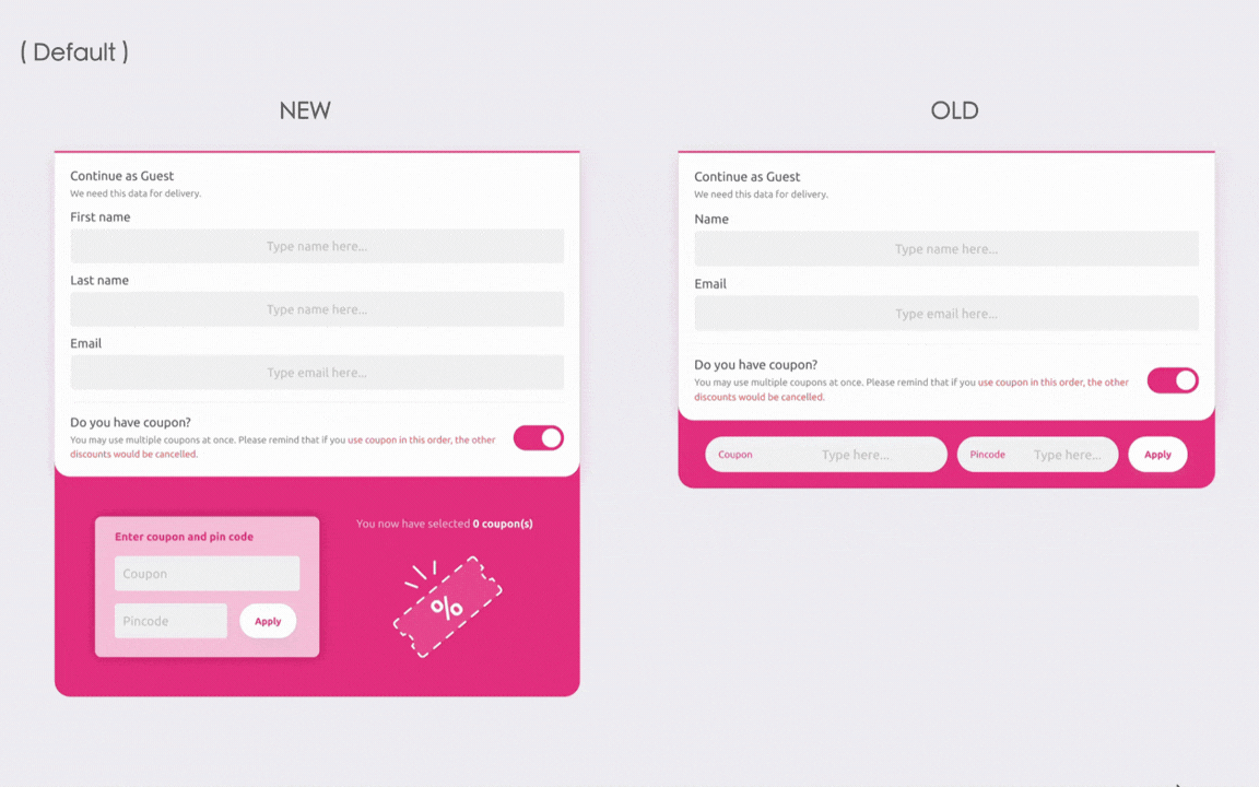
The clearest example was the coupon.
03 How I Worked
The Standard or the Symptom
Most of these changes started the same way: a client BU or our business team flagged something in the live product.
Their first instinct ( and sometimes also mine) was to patch that one spot.
The discipline I tried to keep was to ask two questions first:
Is this problem specific to one brand, or a gap in the standard that every brand inherited?
If it's the second kind, I fix it in the standard — that's how one change reaches 20+ BUs.
Is this a UI/UX bug the front end can just fix, or an enhancement that needs a rethought flow and a proposal?
This is crucial to how the solution is formulated.
These two questions decided how much effort something deserved and which changes earned a place in this case study.
Structure
Across two years, the changes I made fell into three levels — by how deep into the system they reached.
This case study follows that order: Deepest first.
04 Systemic · Deep dive in Coupon
When the brand color eats the error
This is the change I think about most. Not because it went smoothly — the opposite.
Its core problem still isn't fully solved, and why it isn't is itself a design problem worth showing.
The team's first instinct , and why I pushed back
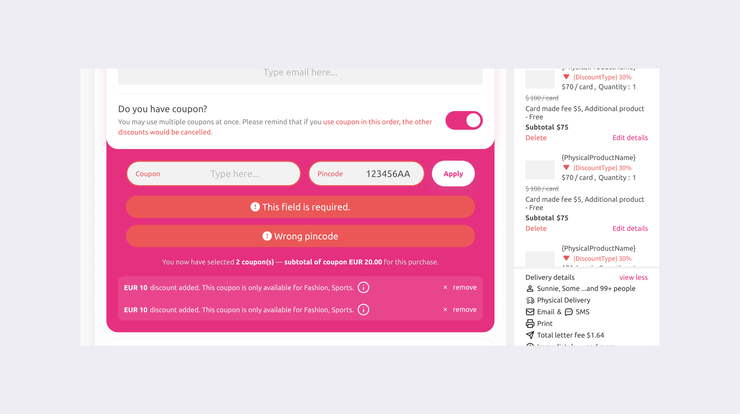
The first plan was narrow: recolor the error so it stopped blending in.I argued that recoloring treats the symptom,
and that it would create two new problems of its own.
Reason 01.
Visibility
A recolored capsule is still a capsule, still the same shape as the input and the button next to it.
The contrast went up a little, but the real problem stayed: the error didn't look like an error.
Reason 02.
The layout jumped
The errors stacked vertically inside the coupon block, so every validation message or added coupon pushed the block taller and shorter.
On a flow where you apply several coupons in a row, the panel kept resizing under the user. The page height never settled.
What I proposed
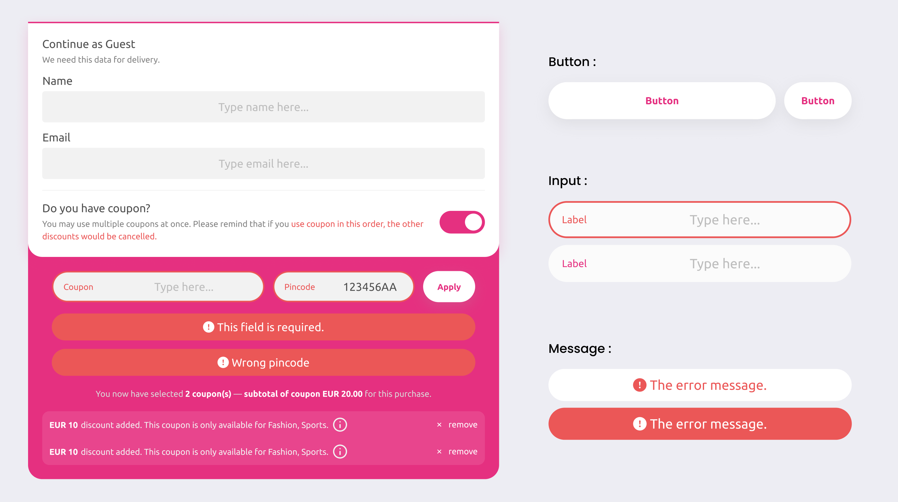
I proposed redesigning the whole block rather than recoloring one element.
The direction was a bit more graphical, so it didn't lean on color to carry the meaning:
Detail 01
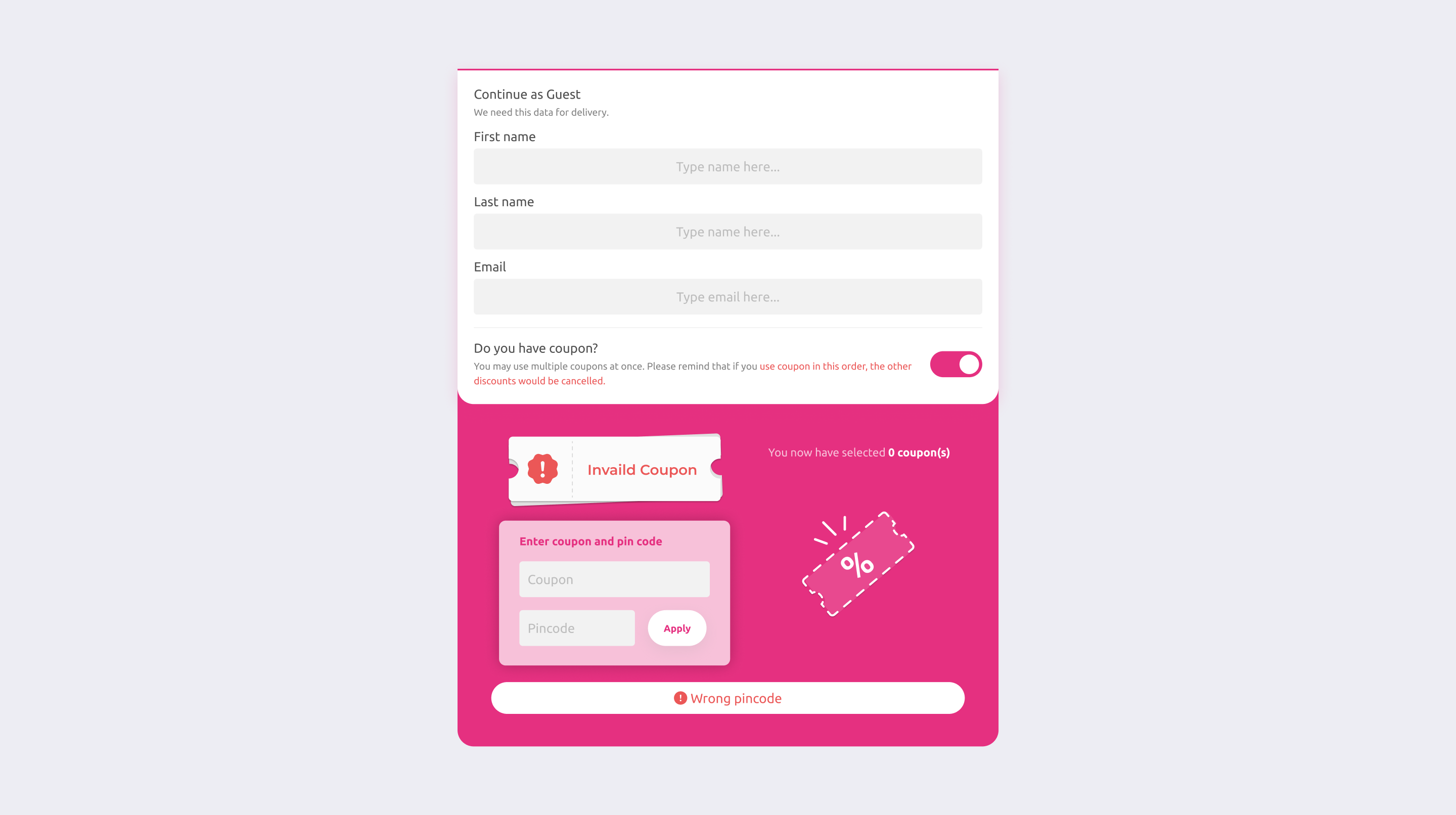
A distinct ticket shape for an invalid coupon — using an icon and a shape that reads as "error" no matter what brand color sits behind it.
Coupon - Invaild Coupon
Detail 02
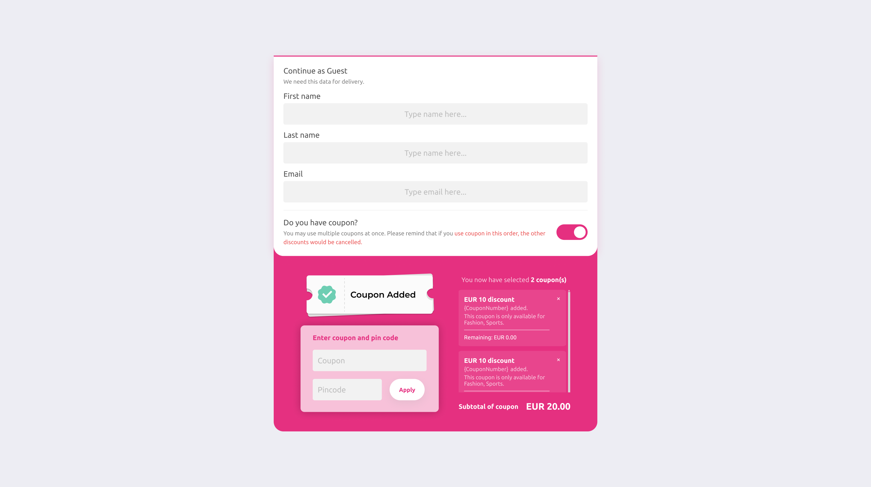
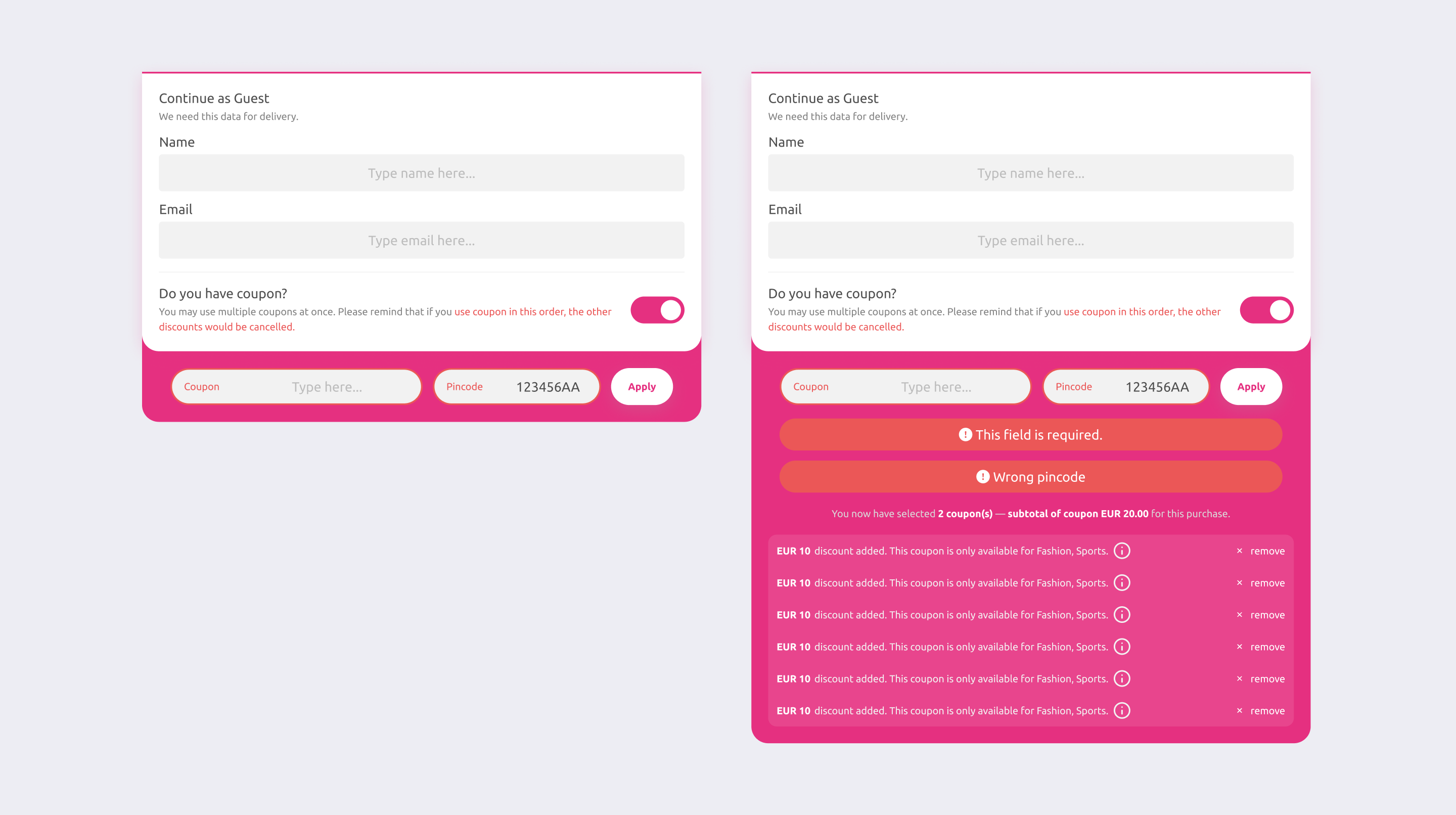
A card based list for applied coupons, each one showing its remaining value and BU restriction, so several coupons stayed readable and the block stopped jumping in height.
Coupon - Multiple coupons added
Where it landed, and where it didn't
I redesigned the standard coupon block, so every BU on master inherited it.
But I want to be honest about the part that stayed open, because it's the more interesting half.
Issue 01
The graphical direction sat in tension with the organization's taste
Part of our business team leans minimal.
A more illustrative, visual forward error state wasn't a direction everyone was comfortable with, and that tension was never fully settled.
Issue 02
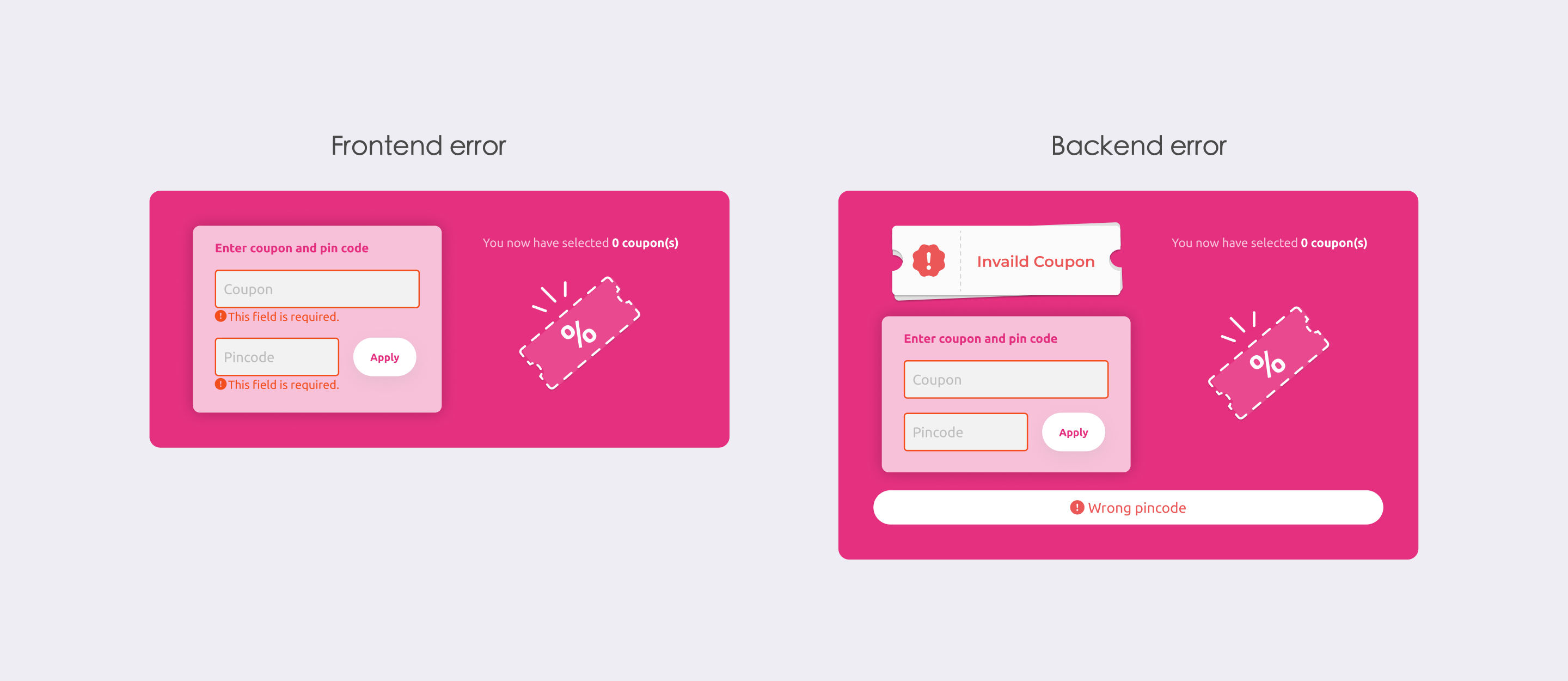
We have two kinds of error, and they didn't get unified
Some errors are caught by frontend validation; others come back as back-end error codes. To keep back-end errors from being eaten by saturated brand colors, we kept the original capsule treatment for that path.
So today the system runs two error styles at once — the new graphical state, and the old capsule. That's not where a consistent system should rest.
Coupon - Two kinds of error status
If I did this again
I'd still push for a fix that doesn't rely on color to tell components apart — I'd just try a different direction. I'd use icon, shape, and position to carry success / error / warning, so the same component reads correctly on blue, red, or pink, and the front-end and back-end error paths could share one container instead of two.
If the main effort went into the message component itself, the coupon layout would only need small adjustments, and could stay minimal.
Looking back, the coupon layout was never really the problem. The problem was this: how should a system signal state when it can't control the color sitting behind it. And that question is still open.
05 Structural · Configurable by Design ( Footer & PDF template )
Not just about a single screen
When one branch is shared by this many BUs, you inevitably hit clients with heavy customization needs.
Sometimes one client's request quietly causes a small problem on another client's platform.
So most of our design here wasn't about a single screen. It was about safe systematization: how to let clients customize without breaking maintainability.
Both of the changes below come down to the same pattern: ship a sensible default, leave room to override.
Case 01
Footer — A default that updates, a custom that doesn't
The footer can run thin or fat.
Instead of handing every BU a blank canvas, we gave them a default they could opt into : A BU on the default automatically picks up later system updates.
A client who needs something fully custom can have us open a separate template built from their own site materials.
Case 02
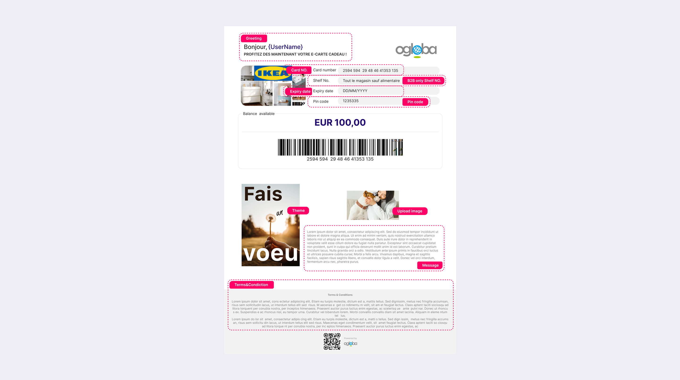
PDF Template — Designing inside a hard constraint
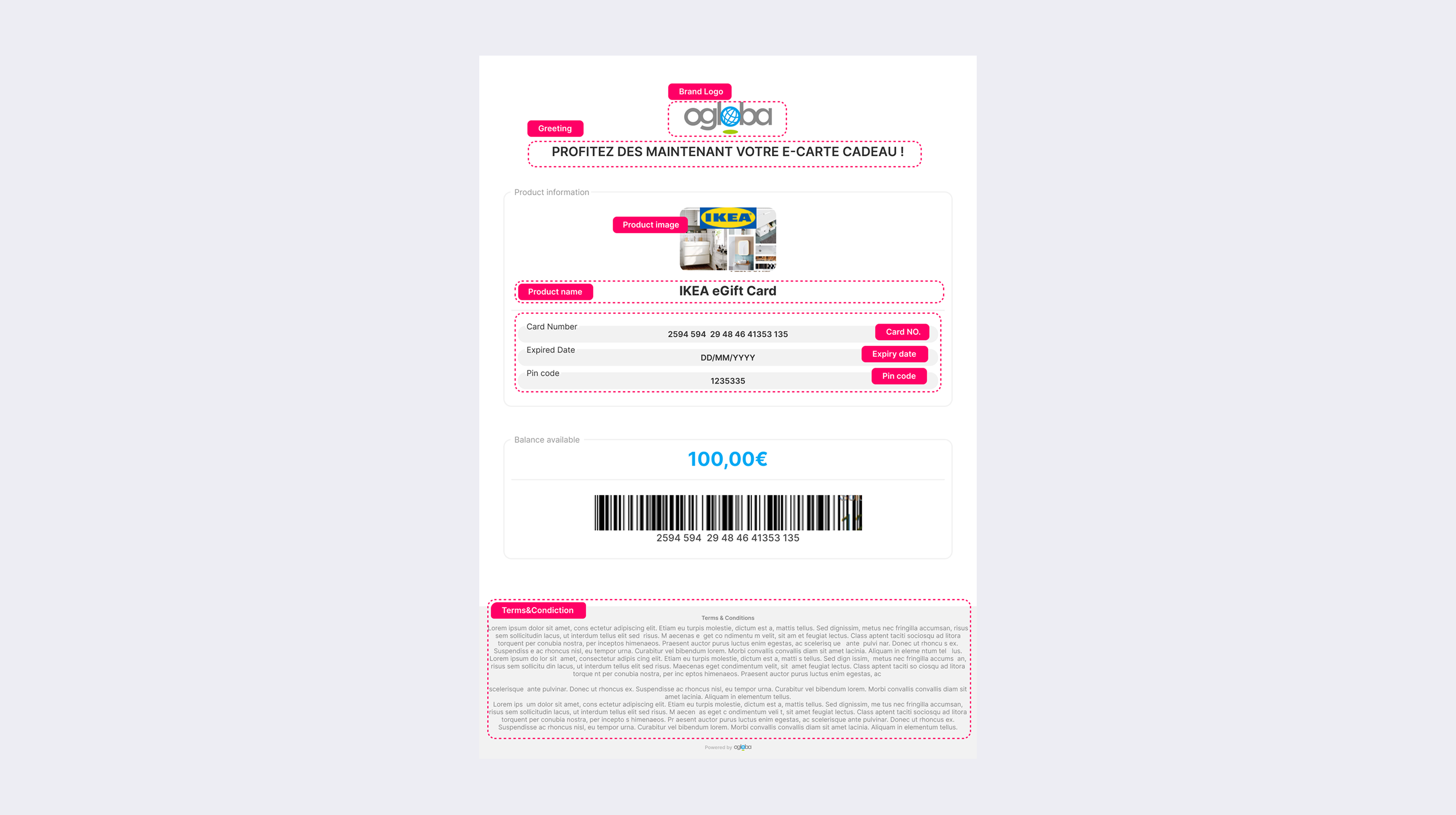
Every gift card purchase ends with a PDF the recipient gets by email : card balance, card number, barcode, card name, artwork ... ect.
It's the last mile of the whole product — the thing the user actually holds, and also the easiest to overlook.
Because it has to feed the backend's PDF generator, each PDF must be the most basic static HTML.
Inside that limit, I designed two things:
→ A complete reference template
The template with every available backend keyword, so engineering and clients could see the full set of fields they could build with.
→ A generic default template
The template that works out of the box, so a client who didn't yet know what they wanted had a clean starting point to react to, instead of a blank page.
Same idea as the footer:
Give the client a good default to start from, take some of the decision off their plate with customization still supported, let us lightly hand-customize each BU's template without starting from scratch.
06 Surface · Quiet Fixes
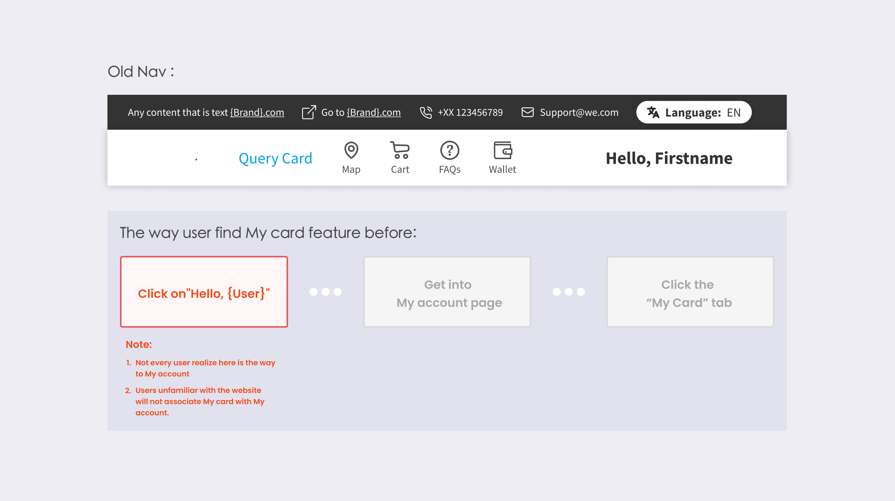
Discoverability and mobile, across the system
Two years of maintaining this system taught me something simple: Most people don't like change.
Faced with a new flow or a new layout, a lot of users get anxious when they can't find the path they were used to.
So not every change needs to be loud. Many problems can be fixed in a small, clean way, solving a little bug almost without the user noticing, and nudging the experience up a notch.
Case 01
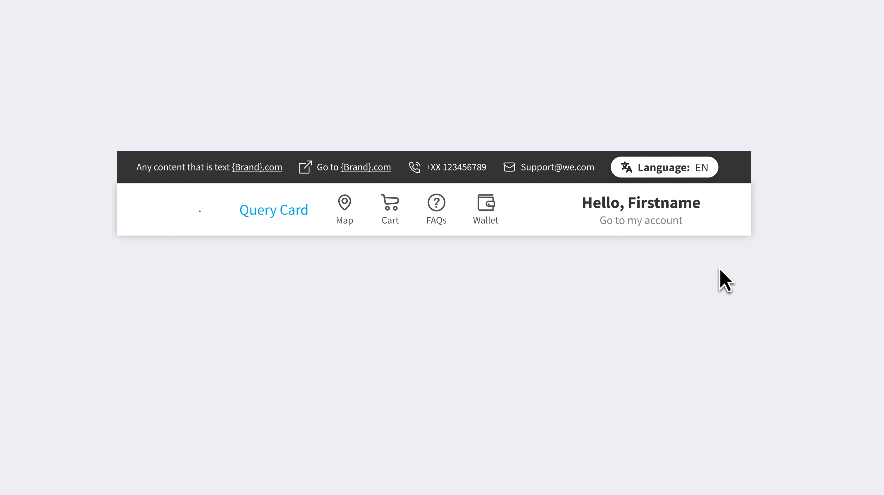
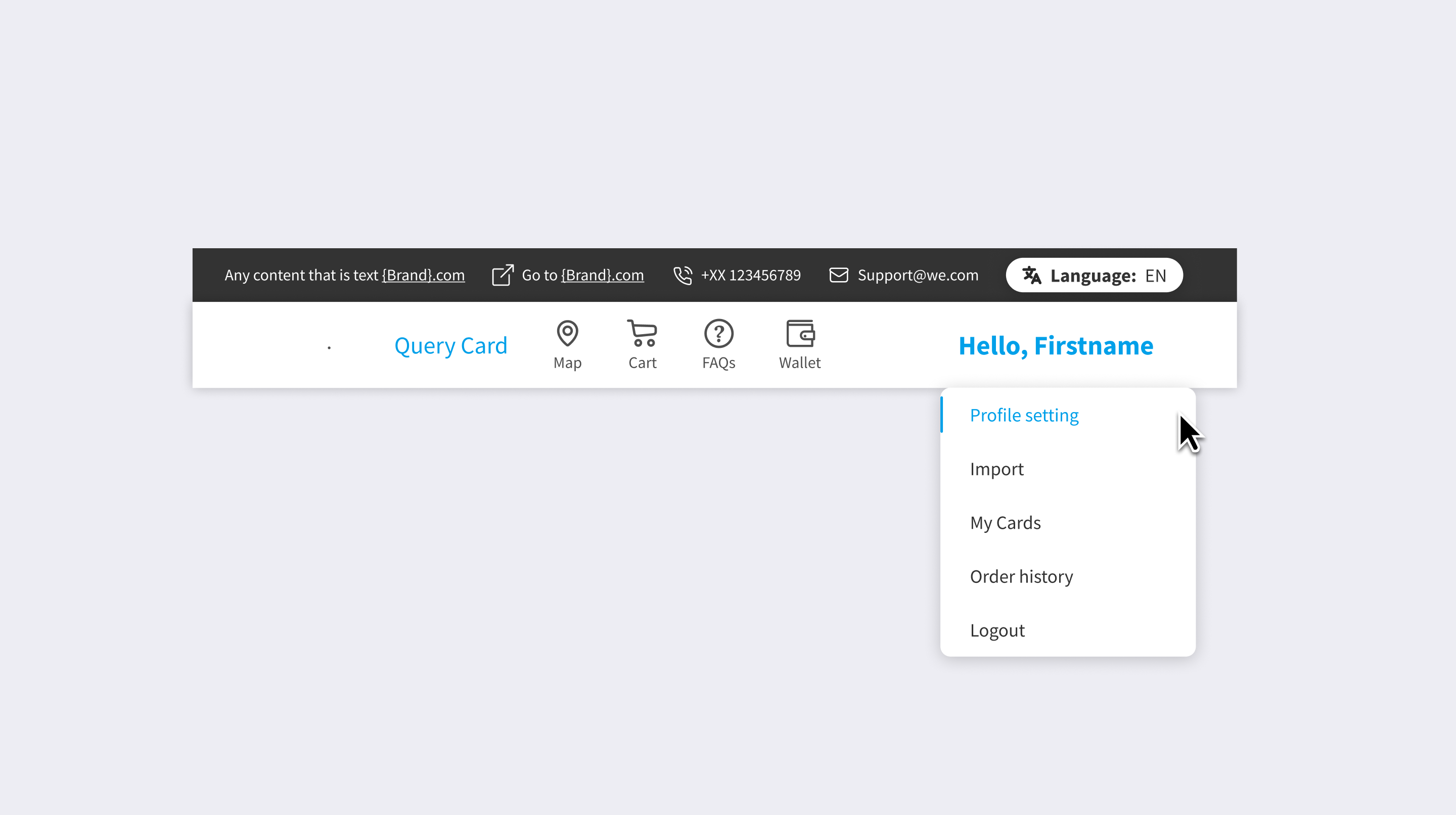
Account dropdown
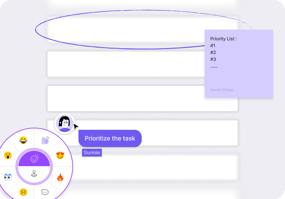
Our users couldn't find "My Cards" easily in previous website, it lived inside the account page with no signpost.
I added a hover dropdown on "Hello, {User}" with a "Go to my account" entry, surfacing My Cards, Order History, and settings straight from the nav.
( Add the subtitle under the UserName )
( Hover on to dropdown the shortcut of each tabs )
Case 02
Cart preview
After that first case, the experience felt slightly off-balance: the cart popup only opened on click, so getting into the buying flow took two clicks.
Old Cart tab on the nav
I made it preview on hover and added the item quantity to the preview, so users could check what they'd added without leaving the page, also user won't get counfused by the total amount.
New Cart tab on the nav
Case 03
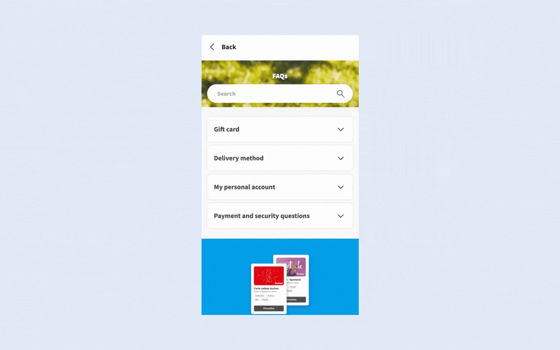
Mobile FAQ
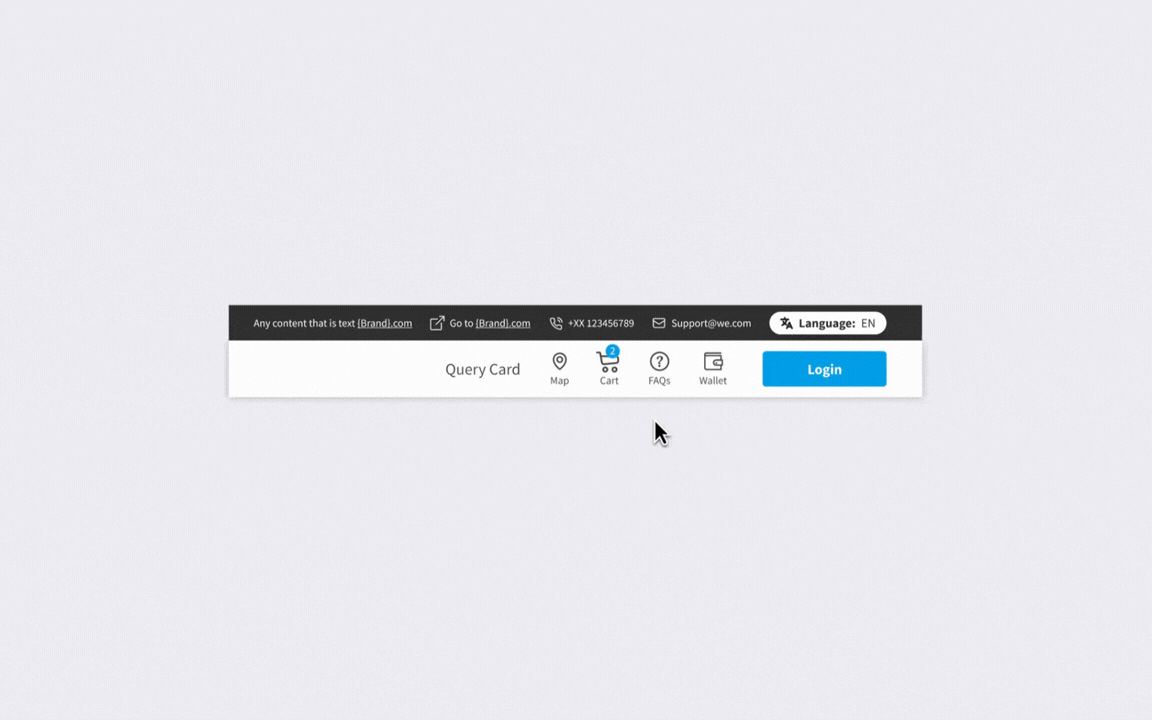
The FAQ was hard to scan on mobile.
I restructured it into a collapsible accordion grouped by topic, so users could jump to a category instead of scrolling a wall of text.
New mobile FAQ drawer
07 Reflection
Designing inside someone else's system
My other projects were about ownership — building something and owning it end to end.
This one taught me the opposite, and a harder thing to name: making good calls inside a system I didn't design, under constraints I didn't set.
A few things stuck with me :
Solving one problem often creates a new one
The coupon change taught me something: when I design a fix for one problem, that fix often brings new problems of its own.
What I learned wasn't how to design the perfect fix. It was how to look honestly at my own solution inside a system that amplifies every decision — what it solved, and what it didn't. Holding both of those at once is part of working in a mature system.
A default is a design decision
The case of Footer and PDF are giving clients a good default to stand on before they knew what they wanted.
This wasn't only a design choice; it changed how we worked with clients.
With a default, clients could react to a working version and adjust from there, which noticeably cut the back-and-forth.In a white-label system, the default is the product for most BUs. Designing it well matters more than designing the edge case.


